一直以來都很習慣用flex來解決排版上面的問題,但最近剛好遇到了一個情況,其實用float會更加方便,今天就來探討一下這個案例
情境說明
基本題
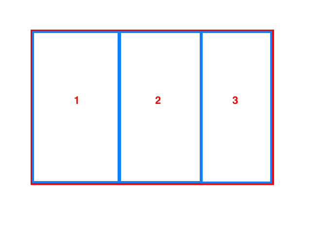
有一個畫面是這樣的,在desktop的寬度下顯示三欄
![desktop]()
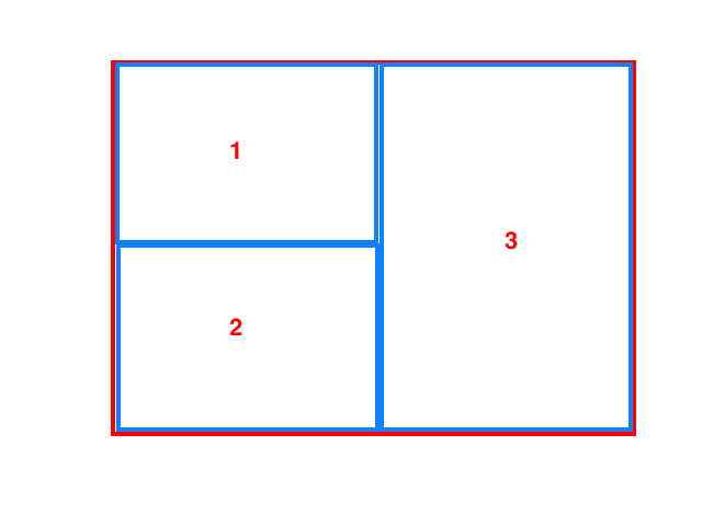
ipad寬度顯示兩欄
![ipad]()
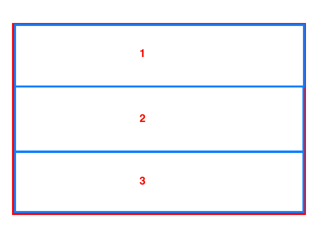
mobile顯示一欄
![mobile]()
進階題
每一個欄的高度都不是固定,會根據資料來變化,並且有max-height超過時,每個欄要自己有scrollbar
使用flex
不管看到幾欄,起手勢就是先來用個flex(誤),先來看看要怎麼樣用flex來實作這塊
desktop、mobile呈現
這種三欄一欄的變化,對於flex來說根本是輕而易舉,只要稍微調整一下就好
1
2
3
4
5
| <div class="container">
<div class="item item1">1</div>
<div class="item item2">2</div>
<div class="item item3">3</div>
</div>
|
1
2
3
4
5
6
7
8
9
10
11
12
13
14
15
16
17
18
| .container{
background: #cacaca;
height: 300px;
display: flex;
}
.item{
flex: 1;
background: #E7F6FC;
height: 100%;
border: 1px solid black;
}
@media screen and (max-width: 599px){
.container{
flex-direction: column;
}
}
|
ipad呈現
使用flex最麻煩的會是ipad的2*1+1的呈現方式,因為比較不好這樣操作,這邊會分作兩種模式來寫
基本題
html不變,只是調整一下css的寫法,加上wrap讓第三欄自動的換行,這這個缺點就是第一欄和第二欄的高度不夠彈性
1
2
3
4
5
6
7
8
9
10
11
12
13
14
15
16
17
18
19
20
21
22
| @media screen and (max-width: 1023px){
.container{
flex-direction: column;
flex-wrap: wrap;
}
.item3{
flex-basis: 100%;
}
}
@media screen and (max-width: 599px){
.container{
flex-direction: column;
flex-wrap: unset;
}
.item3{
flex: 1;
}
}
|
進階題
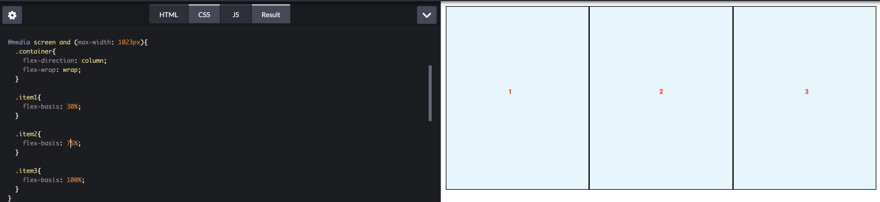
先來做個簡單的微調,看看當欄位資料超過100%會發生什麼事情
1
2
3
4
5
6
7
8
9
10
11
12
13
14
15
16
17
18
19
|
@media screen and (max-width: 1023px){
  .container{
    flex-direction: column;
    flex-wrap: wrap;
  }

  .item1{
    flex-basis: 30%;
  }

  .item2{
    flex-basis: 75%;
  }

  .item3{
    flex-basis: 100%;
  }
}
|
![錯誤的兩欄]()
ㄟ~奇怪,怎麼變成三欄了,說好的兩欄呢!?但應該要怎麼完成我們的需求?其實非常的簡單就是把item1、item2包起來,以結構上來說就是變成兩欄的變化
先來把html做個調整
1
2
3
4
5
6
7
| <div class="container">
<div class="column column1">
<div class="item item1">1</div>
<div class="item item2">2</div>
</div>
<div class="column column2">3</div>
</div>
|
這邊就不寫其他尺寸的css,只先寫一種case
1
2
3
4
5
6
7
8
9
10
11
12
13
14
15
16
17
18
19
20
21
22
| .container{
background: #cacaca;
height: 300px;
display: flex;
}
.column{
flex: 1;
background: #E7F6FC;
height: 100%;
border: 1px solid black;
}
.column1{
display: flex;
flex-direction: column;
}
.item{
border: 1px solid red;
flex: 1;
}
|
使用float
看完flex以後,接著來看看怎麼使用float做到同樣的效果,只是float比較討厭的一點就是必須要清除,不然空間會有問題
desktop
1
2
3
4
5
6
| <div class="container">
<div class="item item1">1</div>
<div class="item item2">2</div>
<div class="item item3">3</div>
<div class="clearfix"></div>
</div>
|
1
2
3
4
5
6
7
8
9
10
11
12
13
14
| .container{
background: #cacaca;
}
.item{
float: left;
width: 33%;
height: 300px;
border: 1px solid black;
}
.clearfix{
clear: left;
}
|
ipad呈現
這邊唯一的問題就是如果有邊框或是底色,第二欄就沒辦法滿版
1
2
3
4
5
6
7
8
9
10
11
12
13
14
15
16
17
18
19
20
21
22
23
24
25
26
27
28
29
30
| .container{
background: #cacaca;
}
.item{
border: 1px solid black;
box-sizing: border-box;
}
.item1{
height: 100px;
width: 30%;
float: left;
}
.item2{
height: 200px;
width: 30%;
float: left;
clear: left;
}
.item3{
display: inline-block;
width: 70%;
}
.clearfix{
clear: left;
}
|
mobile
這邊就都把float拉掉就行,因為block預設就是一個row的行為
小技巧
我有一個算是潔癖?或是怪癖?希望不要出現多餘的html,像是clearfix的element,但是float一旦沒有被清除,parent的空間呈現上是有問題的,這時候有沒有比較好的作法呢?
有兩個方法可以解決這問題
pseudo element
1
2
3
4
5
| .container::after{
content: '';
display: block;
clear: left;
}
|
overflow,這是一個奇淫技巧,可以發現有一樣的效果
1
2
3
| .container{
overflow: hidden;
}
|
結論
其實不管用哪個來實作都可以,都可以做出目的的效果,但在寫css的時候還是可以看一下應用的情境,也許剛好那個情境會比較適合,那何必要用更麻煩的方式來完成呢
最後來推廣一下Amos的youtube頻道和FB粉絲團,最近在暴力班收穫滿滿阿